The following provides guidance on combining the elements into layouts.
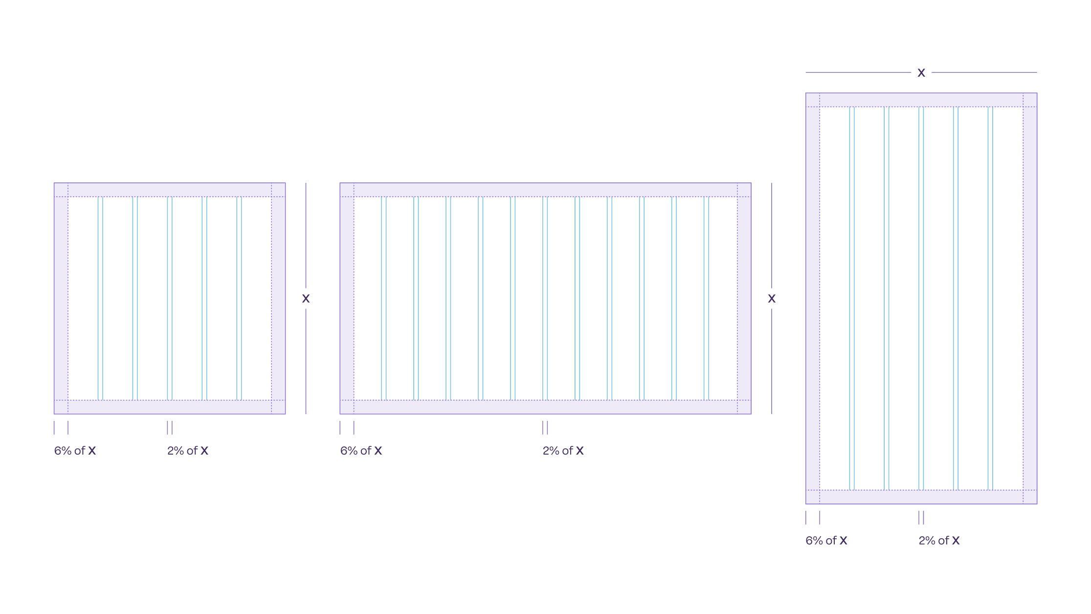
Grid and Usage
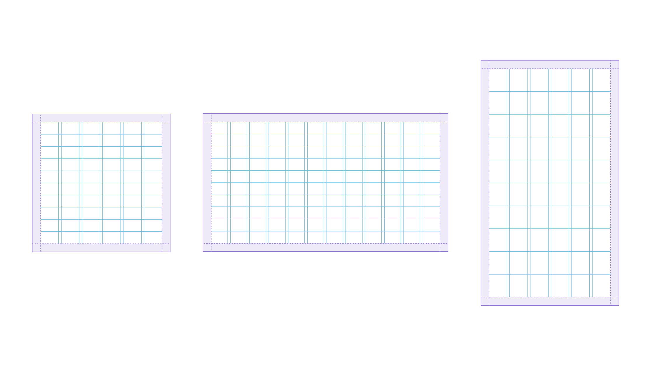
Using a grid helps keep layouts consistent, clean and organised.
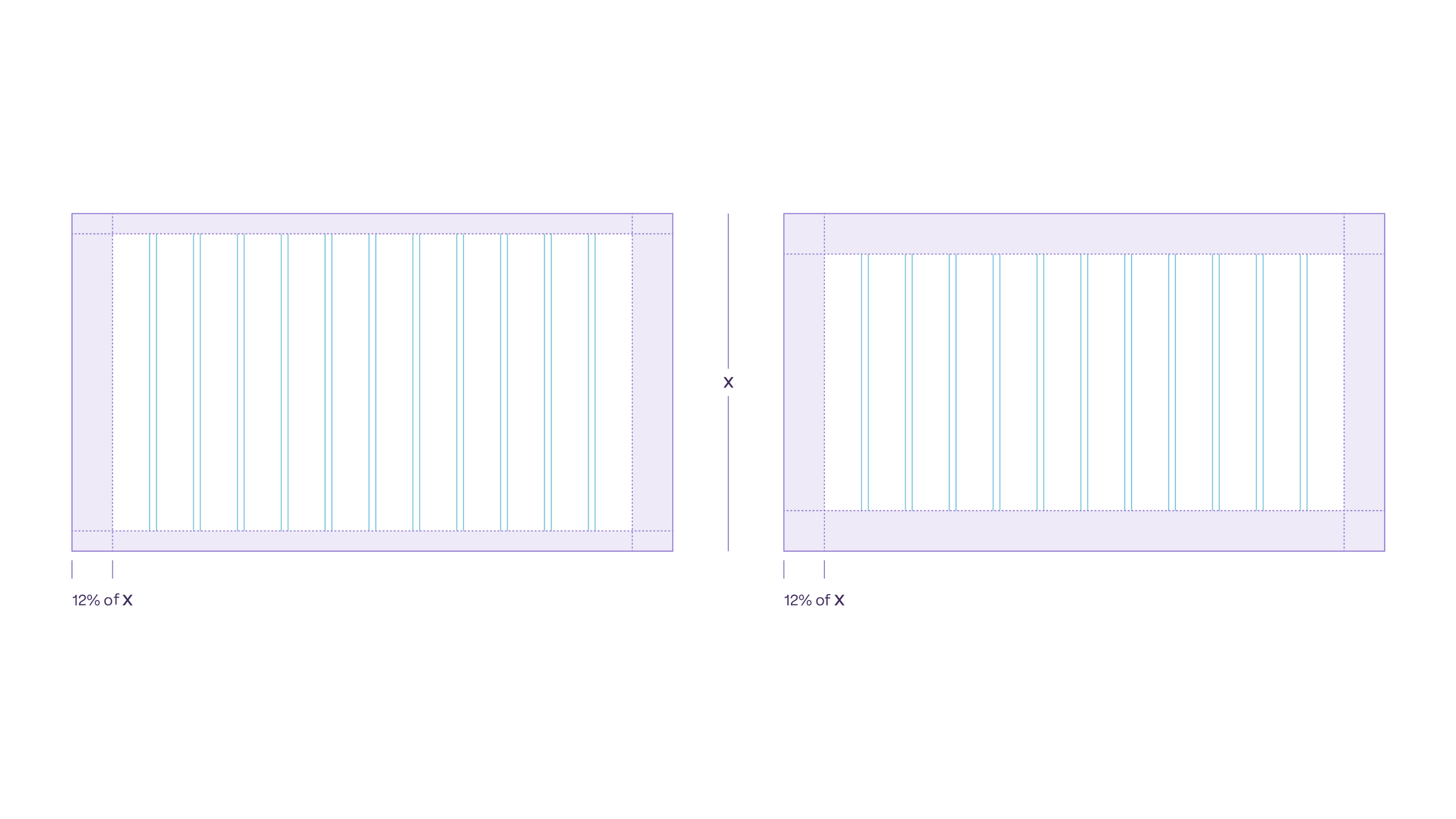
Margins should be either 6% or 12% of the asset’s shortest side—
6% works well for social media assets, while larger marketing materials usually need 12%.
For structure, use a 6-column grid on square and portrait assets, and a 12-column grid for wider formats like 16:9. Gutters between columns should be 2% of the asset’s shortest side.
Content frame corners are always rounded, with a radius set to either 3% or 6% of the assets shortest side.
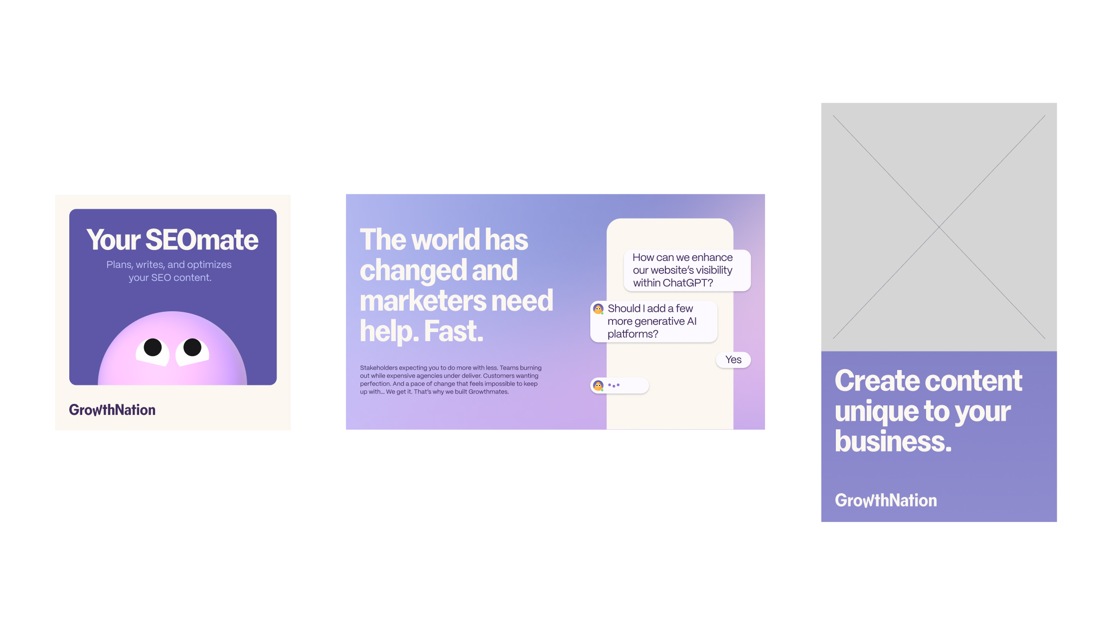

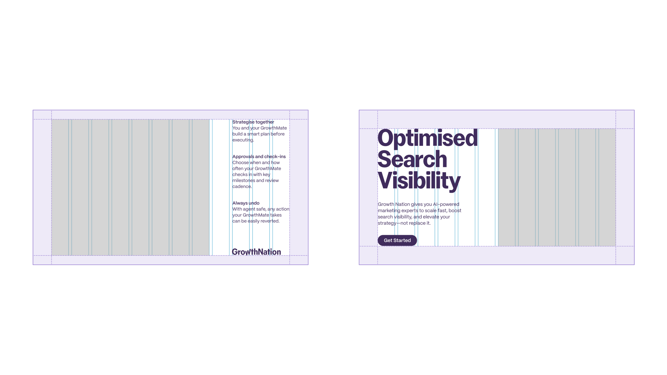
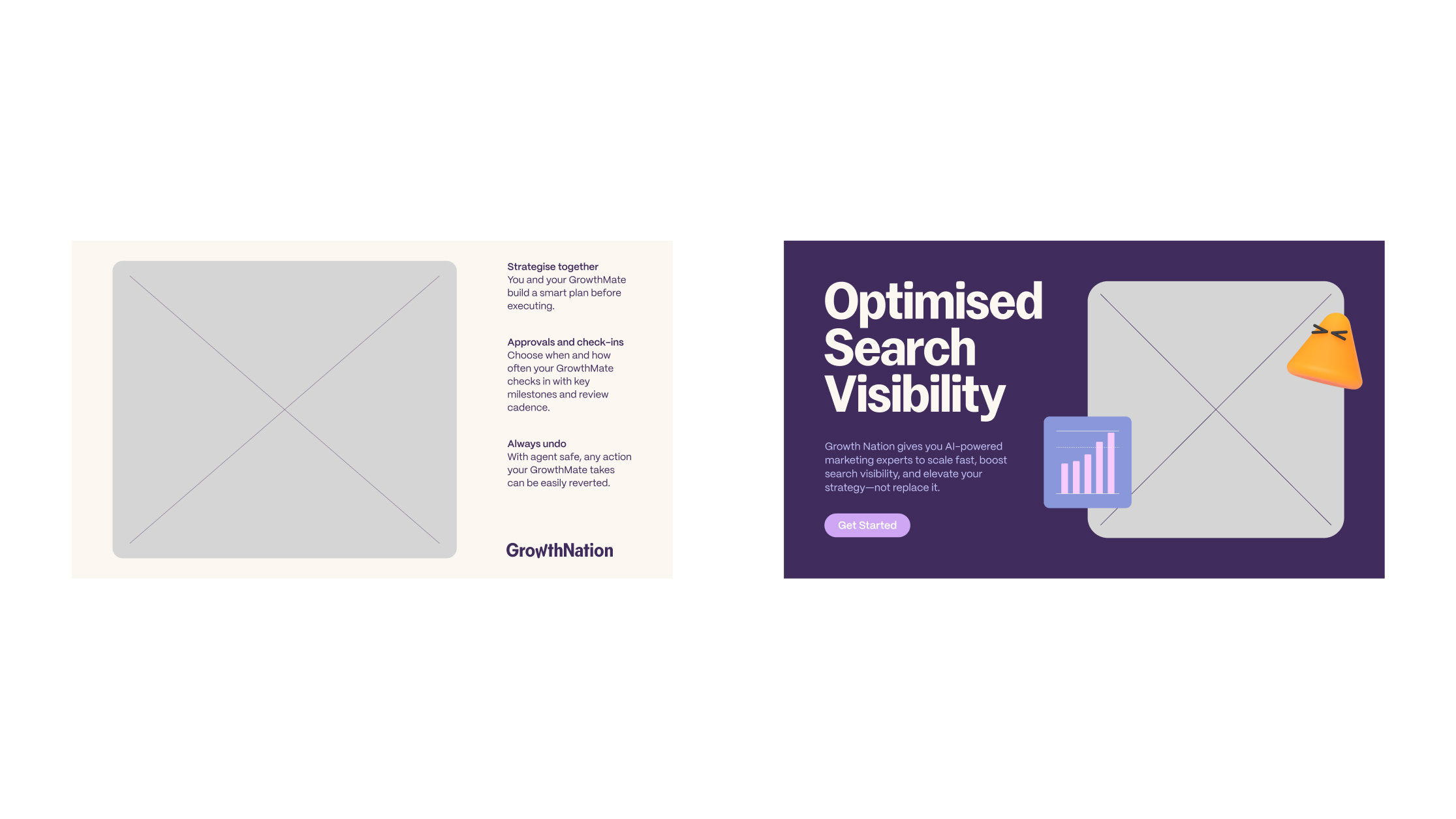
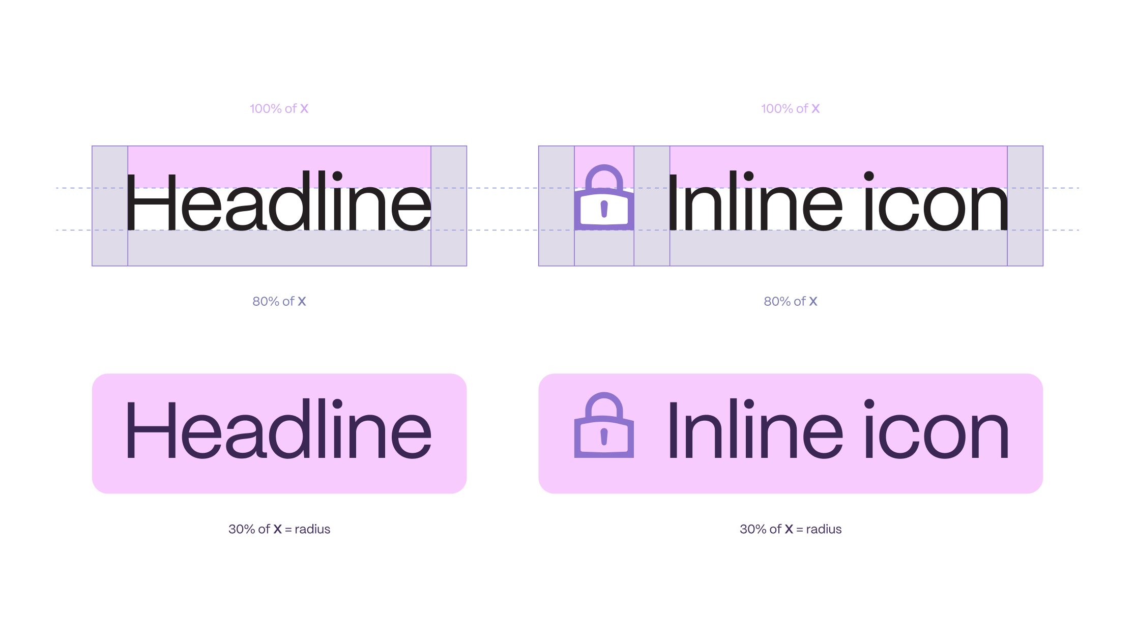
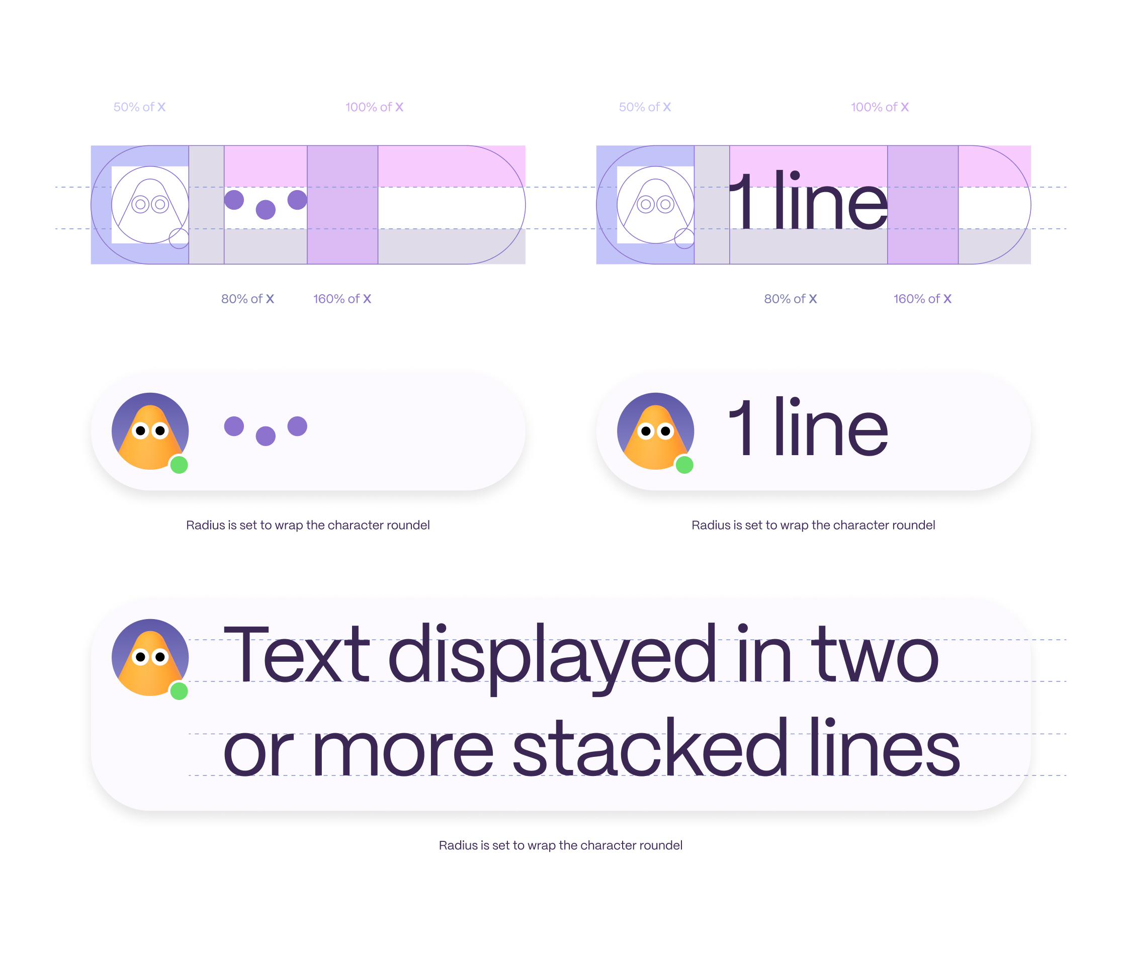
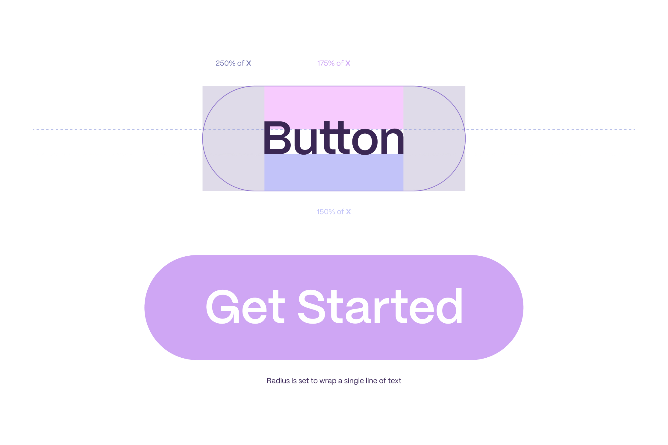
Layout Guidelines for Headlines, Chat Modules, and Buttons in Marketing Materials.
This section outlines the key rules for arranging Headlines, Chat Modules, and Buttons to ensure consistency across marketing materials.
The included diagrams illustrate margin and spacing expressed as percentages relative to the font’s ‘x’ height, helping you maintain balanced spacing and a clean, cohesive layout.